⭐Week1-week3(1.4.2022-1.20.2022)
Wu Tianyu / 0353484 / Bachelor of Design (Hons) in Creative Media
Design Principles
Exericse
LECTURES
• Point
A point or dot is the simplest element of design.
• Line
Lines can indicate directions, define boundaries of shapes and spaces, imply volumes or solid masses, and suggest motion or emotion.
• Shape
Refers to the expanse within the outline of two-dimensional area or within the three-dimensional object.
• Form
Whereas a two-dimensional area is referred to as a shape, a three-dimensional area is called a form.
• Texture
In visual communication design, texture refers to the tactile qualitiesof surfaces or to the visual representation of those qualities.
• Space
Space is the indefinable, general receptacle of all things – the seemingly empty space around us.within these limited boundaries, an infinite number of spatial qualities can be implied.
• Colour
Colour is the visual byproduct of the spectrum of light as it is either transmitted through a transparent medium, or as it is absorbed and reflected off a surface. Colour is the light wavelengths that the human eye receives and processes from are flected source.
• Contrast
Contrast is the juxtaposition of strongly dissimilar elements.Without contrast, visual experience would be monotonous.Contrast can provide visual interest, emphasise a point and express content.
• Balance
Balance refers to the distribution of visual weight in a work of design. It is the visual equilibrium of the elements that causes the total image to appear balanced.
• Emphasis
Emphasis is used to create dominance and focus in a design work.
• Repetition/Pattern/Rhythm
Repetition could make a work of design seem active. The repetition of elements of design creates rhythm and pattern within the work. Pattern increases visual excitement by enriching surface interest.
• Movement
The way a design leads the eye in, around, and through a composition - the path the eye follows.
• Hierarchy
Hierarchy is the choreography of content in a composition to communicate information and convey meaning.
• Alignment
Alignment is the placement of elements in a way that edges line up along common rows or columns, or their bodies along a common centre.
• Harmony
Harmony involves the selection of elements that share a common trait.
• Unity
Unity refers to the repetition of particular elementsthroughout your design — whether they’re colors, shapes or materials — to pull the look together.
• Proportion
Scale and proportion are both design elements that have to do with size. Scale is the size of one object in relation to the other objects in a design or artwork.
EXERCISE
1.
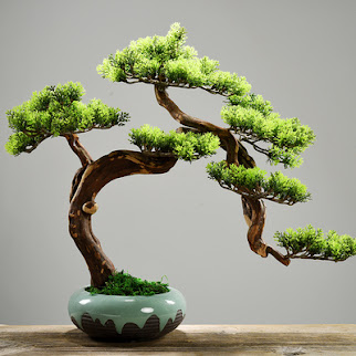
First, I saw a bonsai on Taobao (a shopping site in China), and I decided to use this pine tree to create.The picture below is the source of inspiration, because deer is also my personal favorite animal, so I also hope to use this element to create
The inspiration for my creation was a wallpaper about deer I saw on the Internet, so I wanted to combine the elements of "deer" and "pine tree", just like the antlers of the deer are like branches,and the pine tree looks like a jumping deer, so I made this sketch
Because I am not satisfied with the simple line performance, it seems that the picture is too simple, and I think the pot below limits the "freedom"of the "deer",So I did some background processing
After processing, I found that the element of the pine tree could not be clearly seen in the picture, so I found a picture of the pine tree and filled it in the picture
In my images, deer are the animals representing the forest, and I also yearn for the freedom of those deer in the sparsely populated pine forest.
Here is the final result
2.
After watching "After the rain"(恋は雨上がりのように), I wanted to use this drama to create something


评论
发表评论